Honey Hill Farm
Client: Honey Hill FarmThese are some studies for a re-brand of a company formerly known as Joan’s A Keeper. These explorations started with a candle and began to exapnd to the rest of the line of home and health goods.

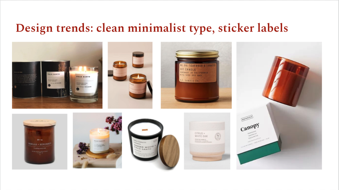
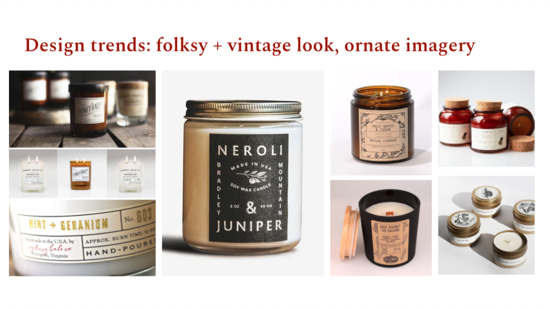
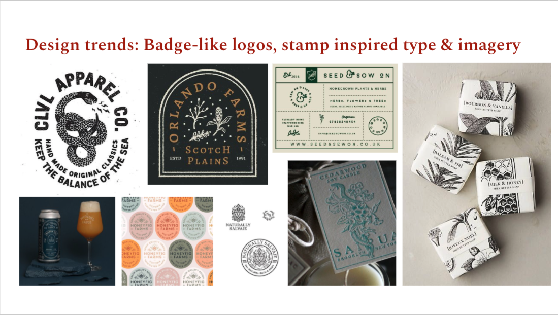
Initial Explorations
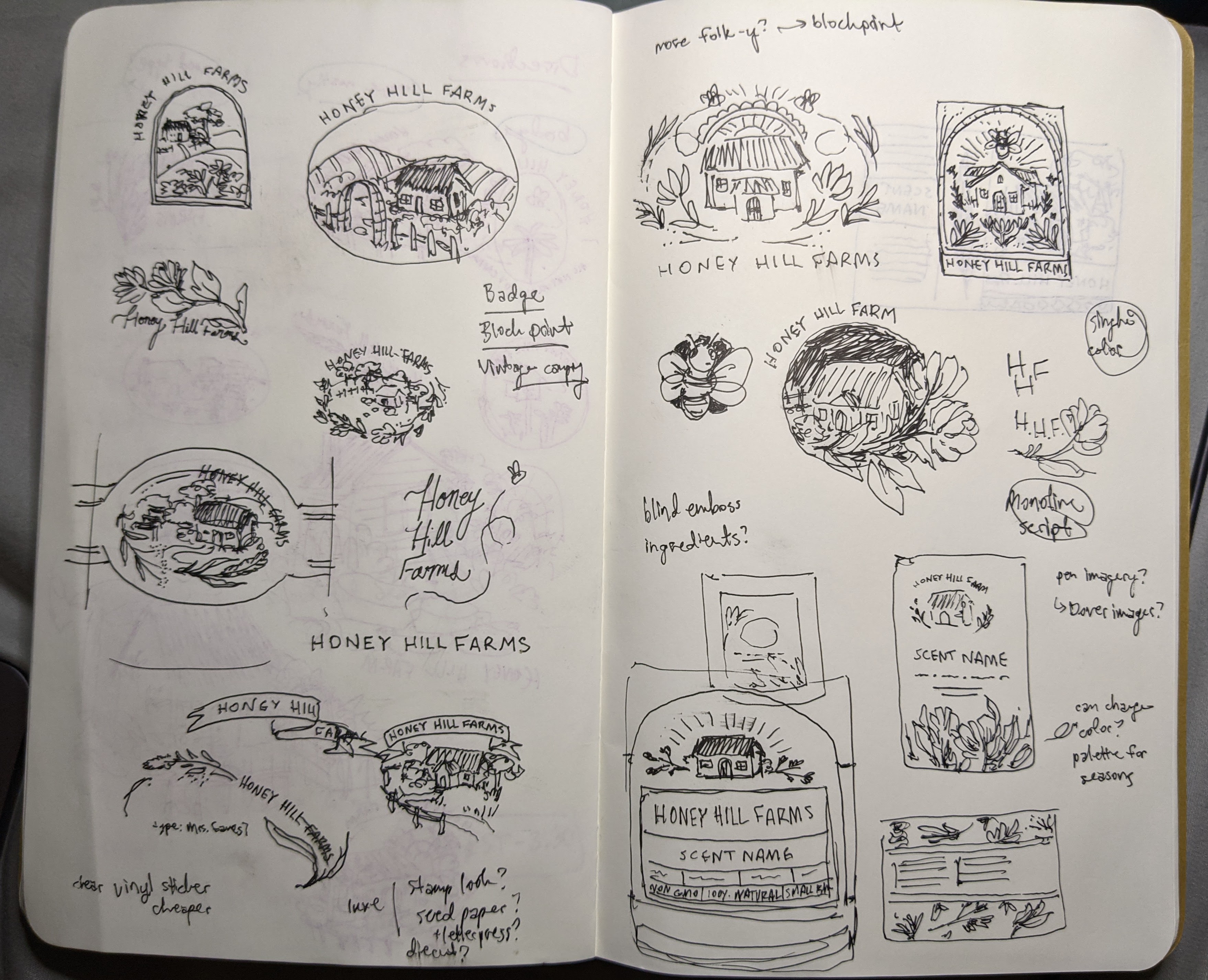
Sketches exploring the possibility of Honey Hill Farms as a physical and friendly place
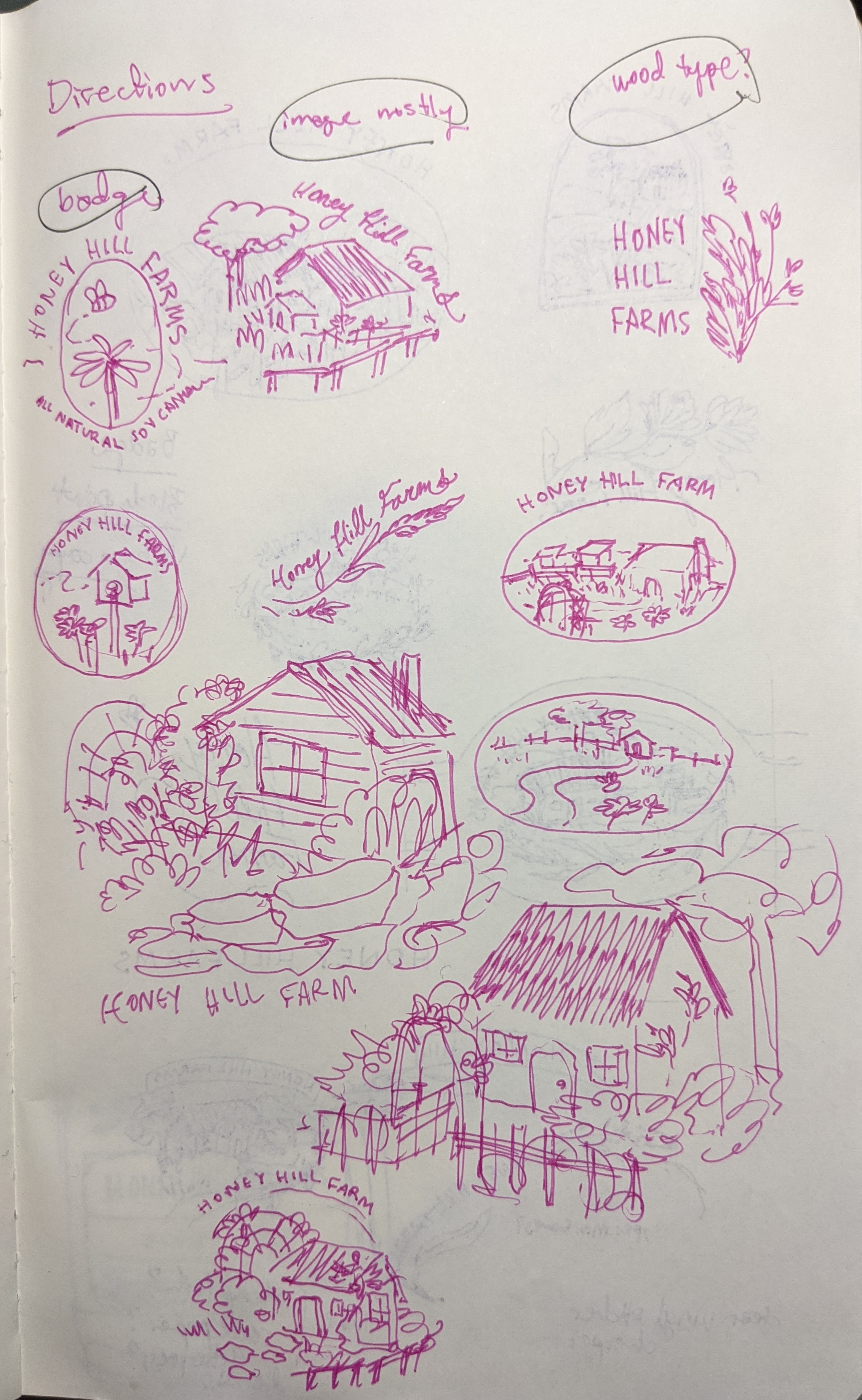
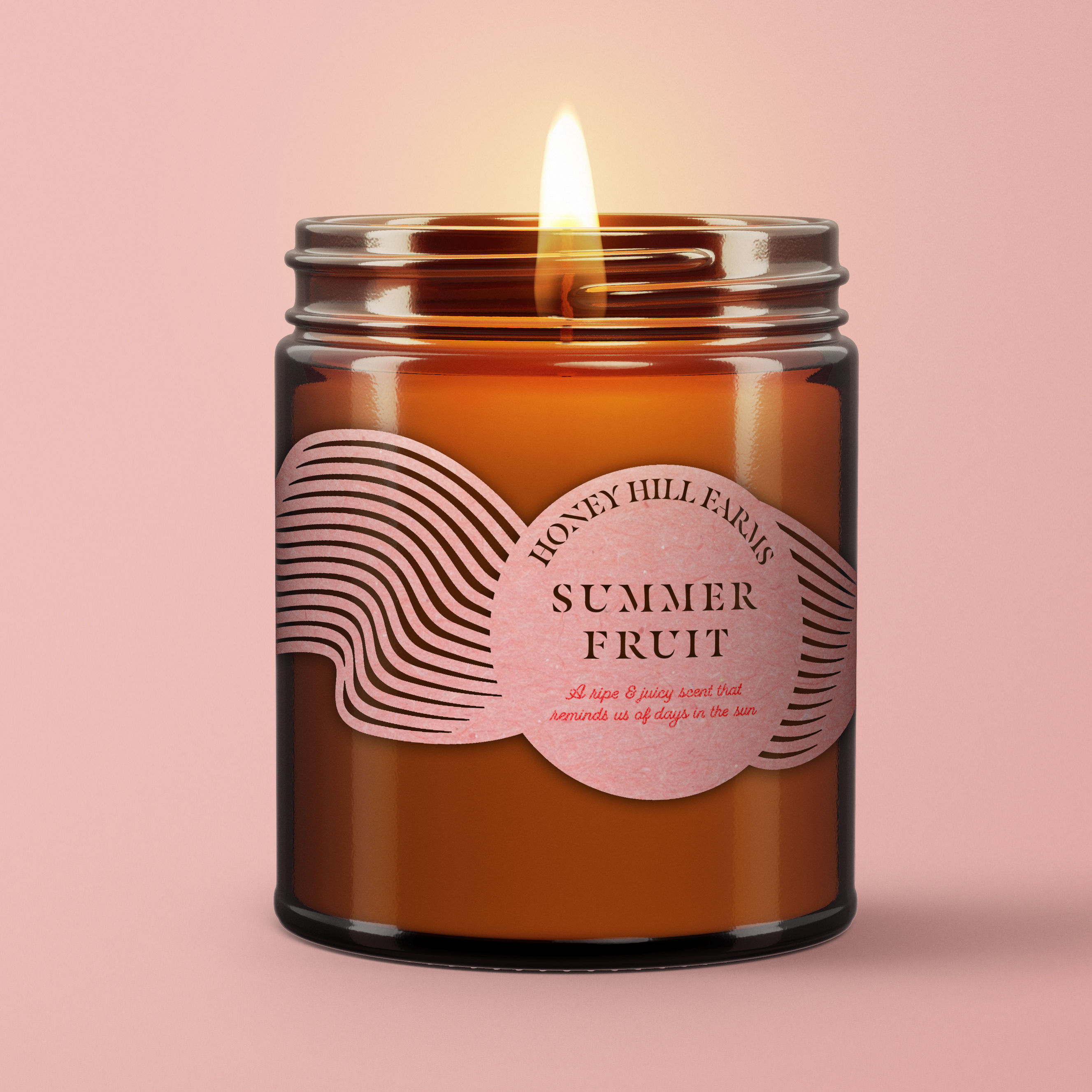
Second round of studies
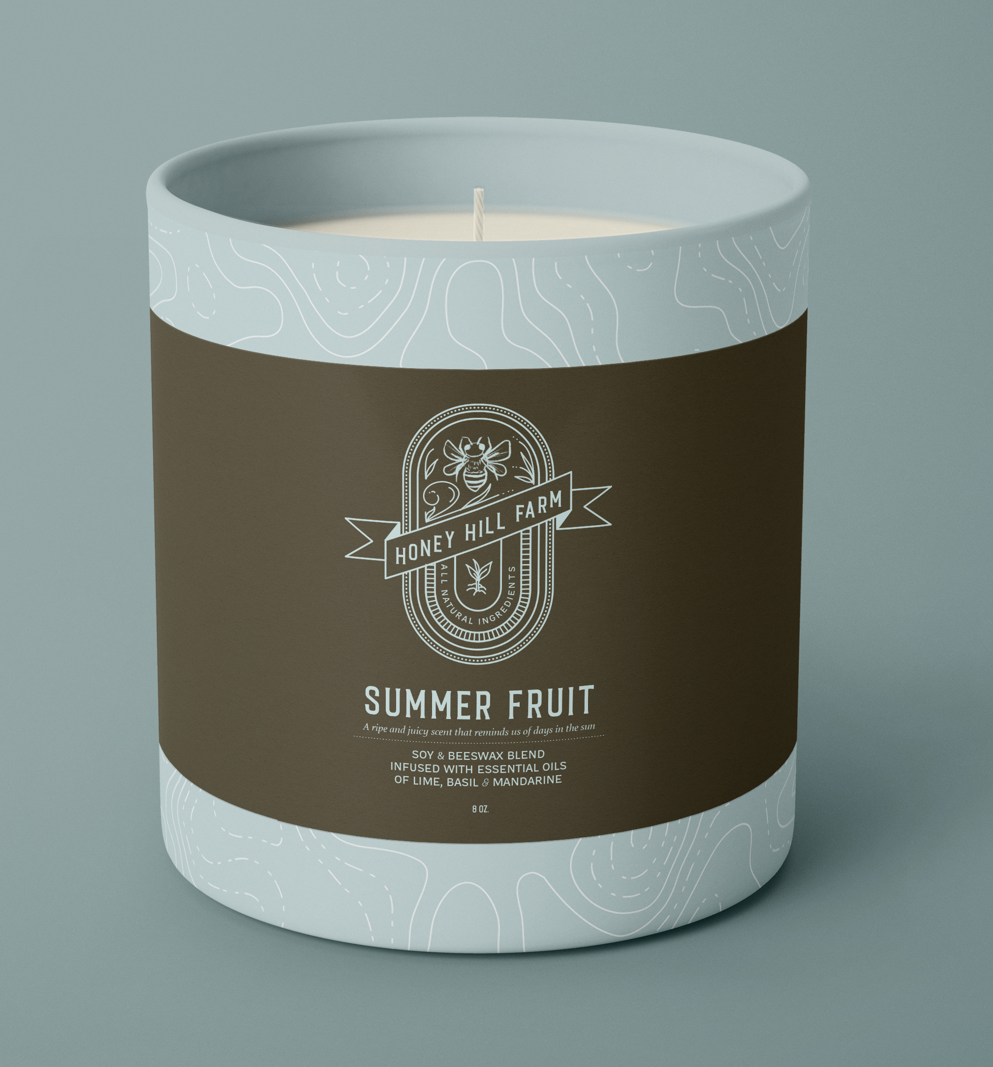
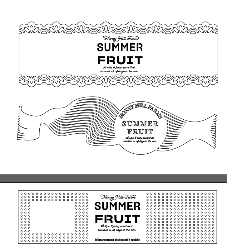
Having settled on an amber vessel and paper label approach, I played with different label versions that “broke” the mold of traditional candle packaging. I especially looked at different production methods like diecuts to explore ways to transform a simple material like paper.
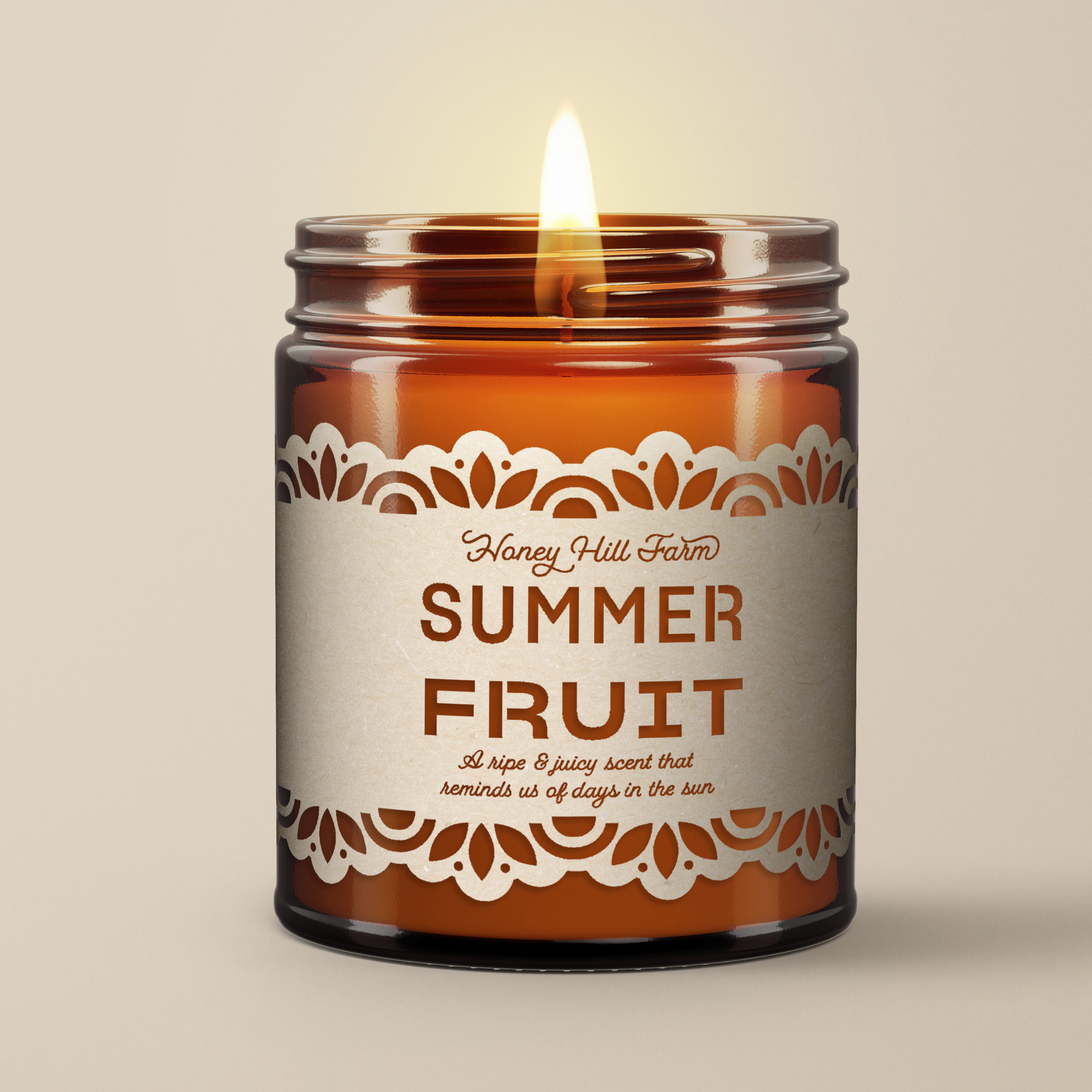
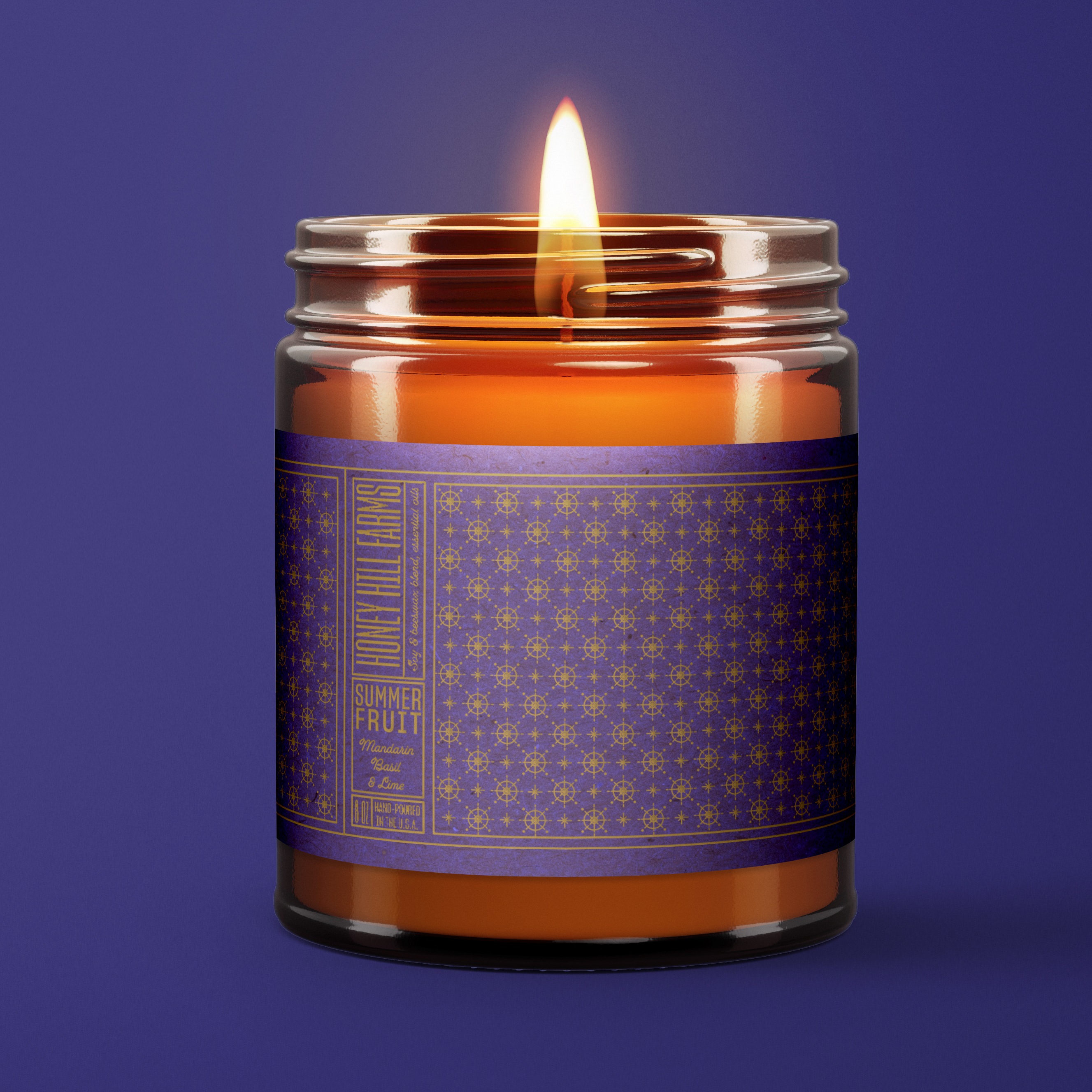
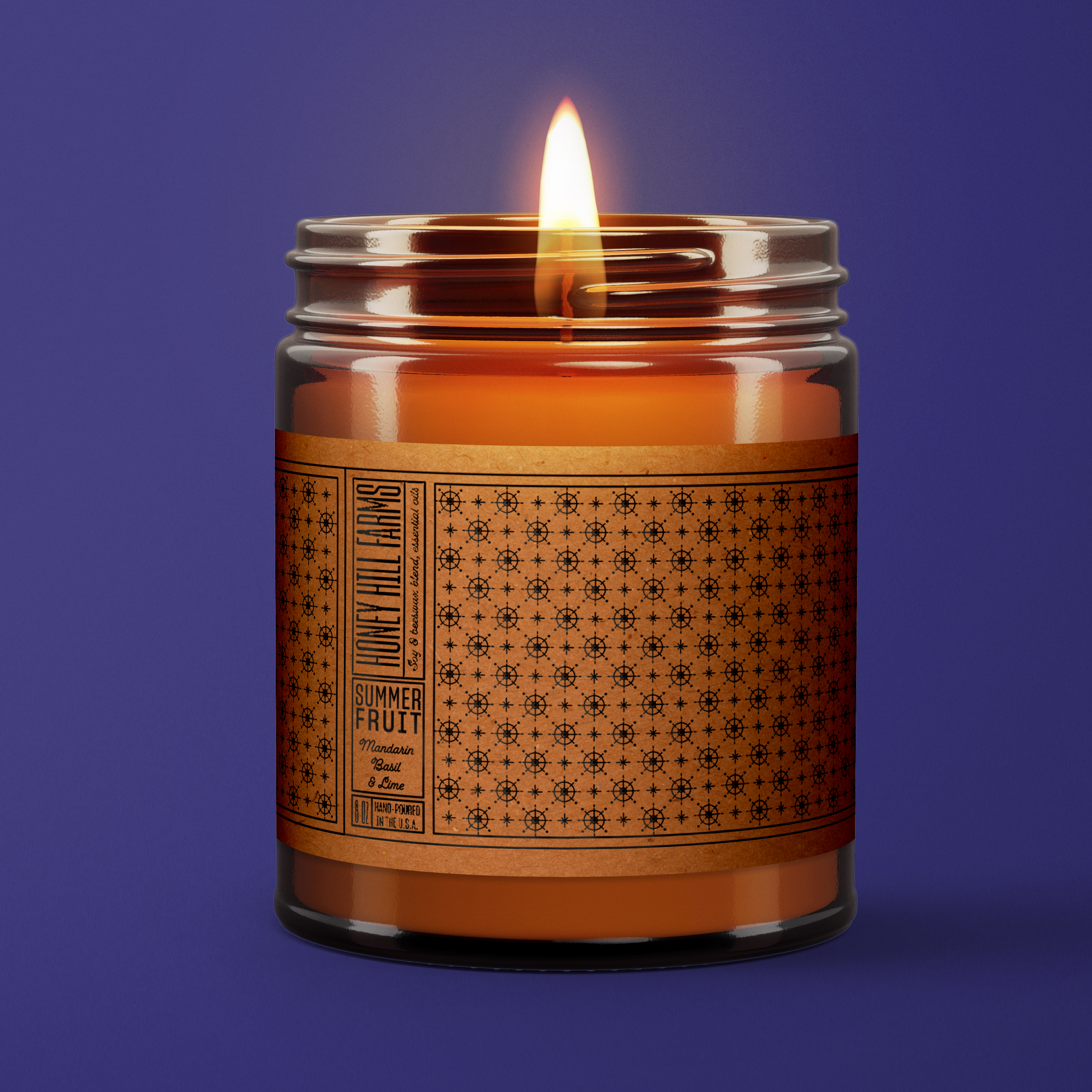

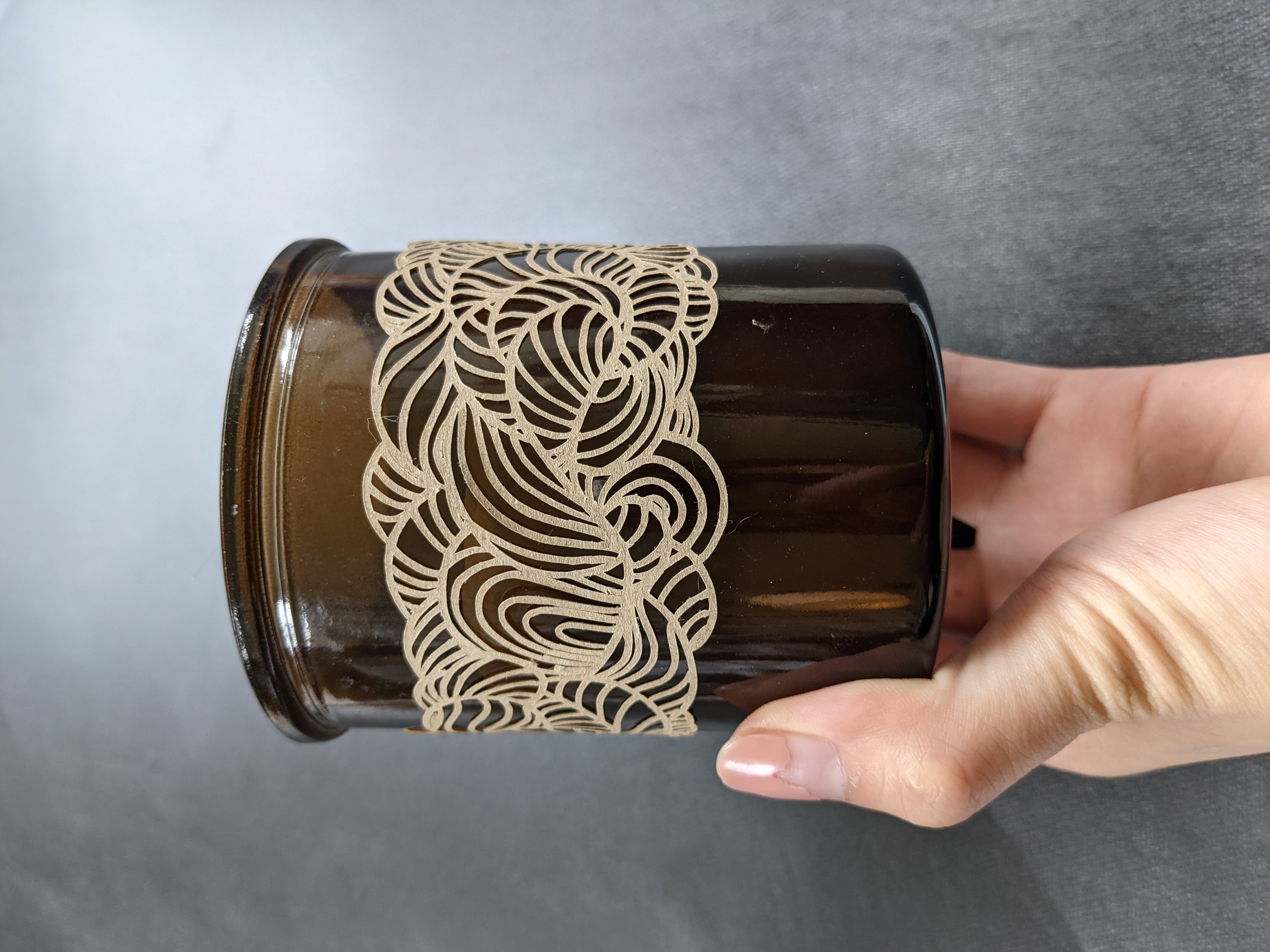
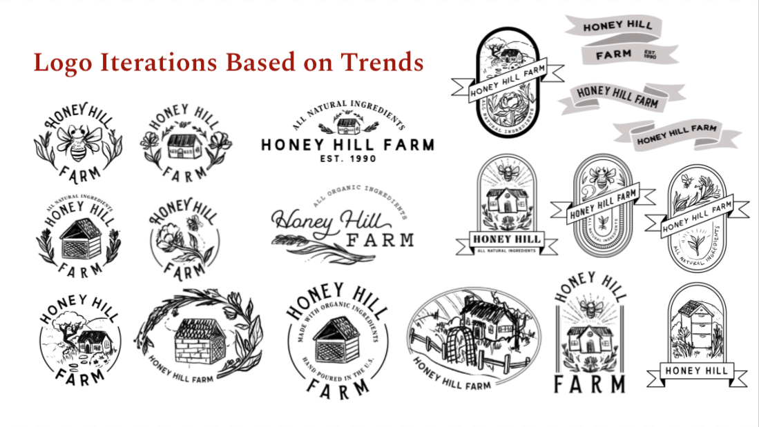
Ultimately, the client favored a re-hash of this maximalist approach from the initial study.
II. Brand Expansion
A. Intro
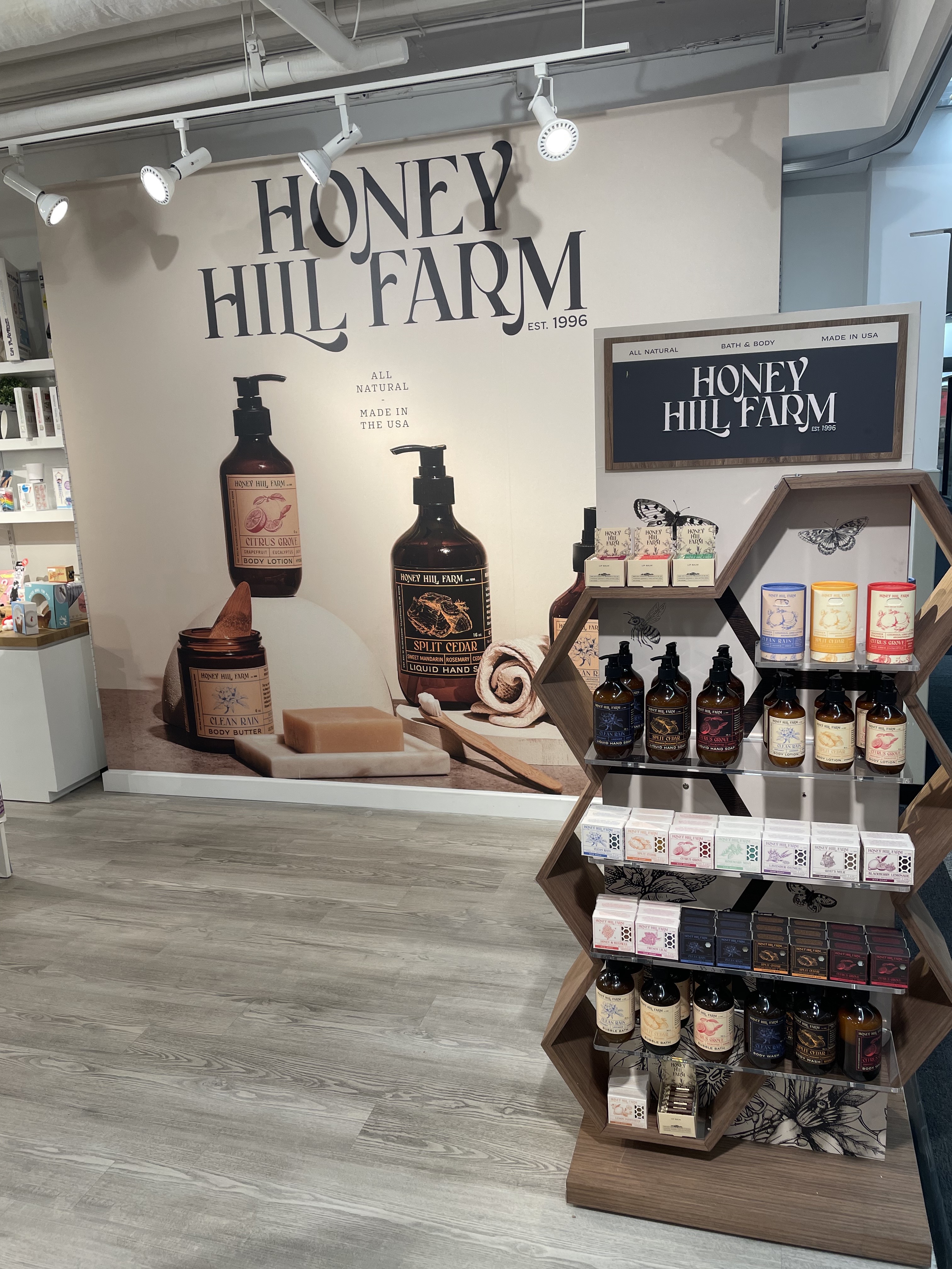
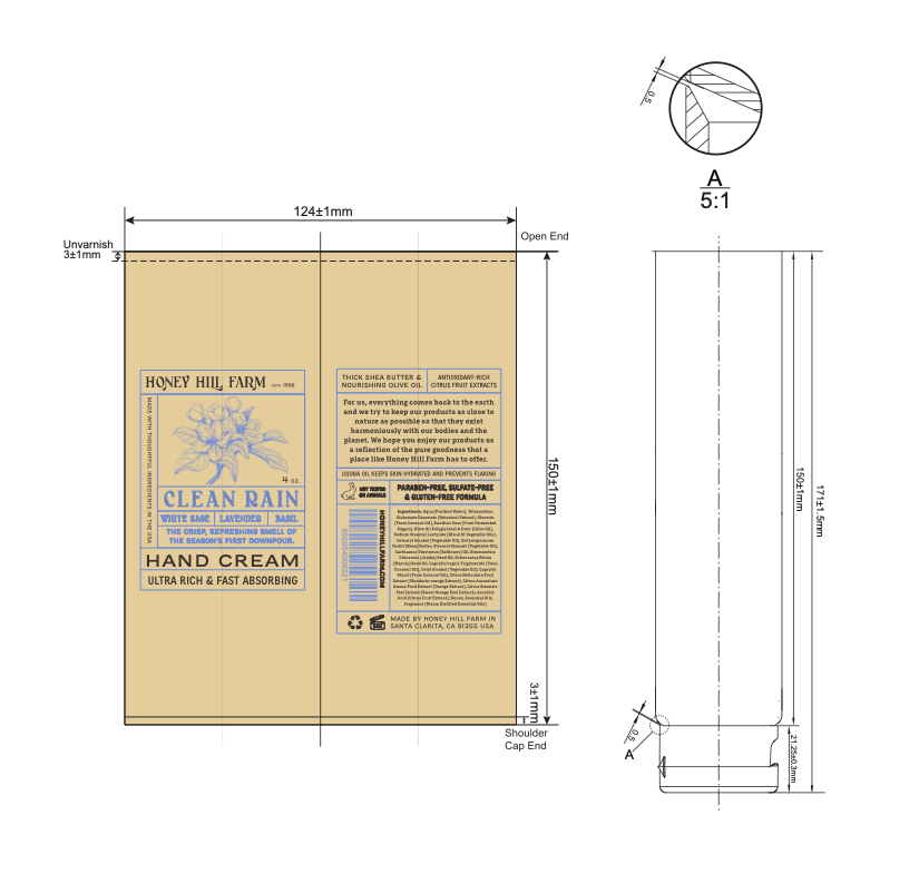
HHF requested an expansion on the maximalist approach. Under tight budget and time constraints, the challenge became creating a modular system for three different scents across a line of 10+ products. At the commencement of the project, neither the scents, templates, nor printing methods had been decided. I advised on a strategy for design, implementation, and worked with several vendors to customize solutions.
 Delight, one of the named farm animals
B. Production Strategy
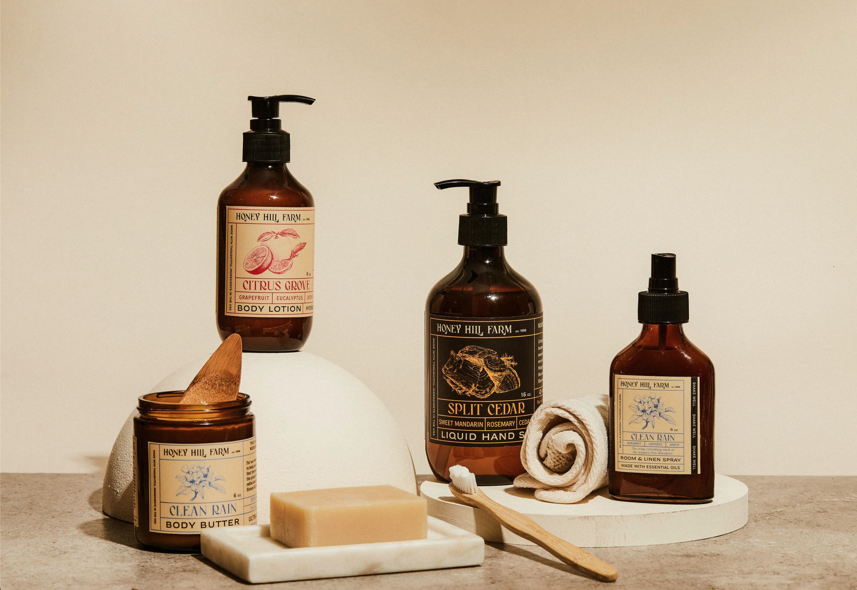
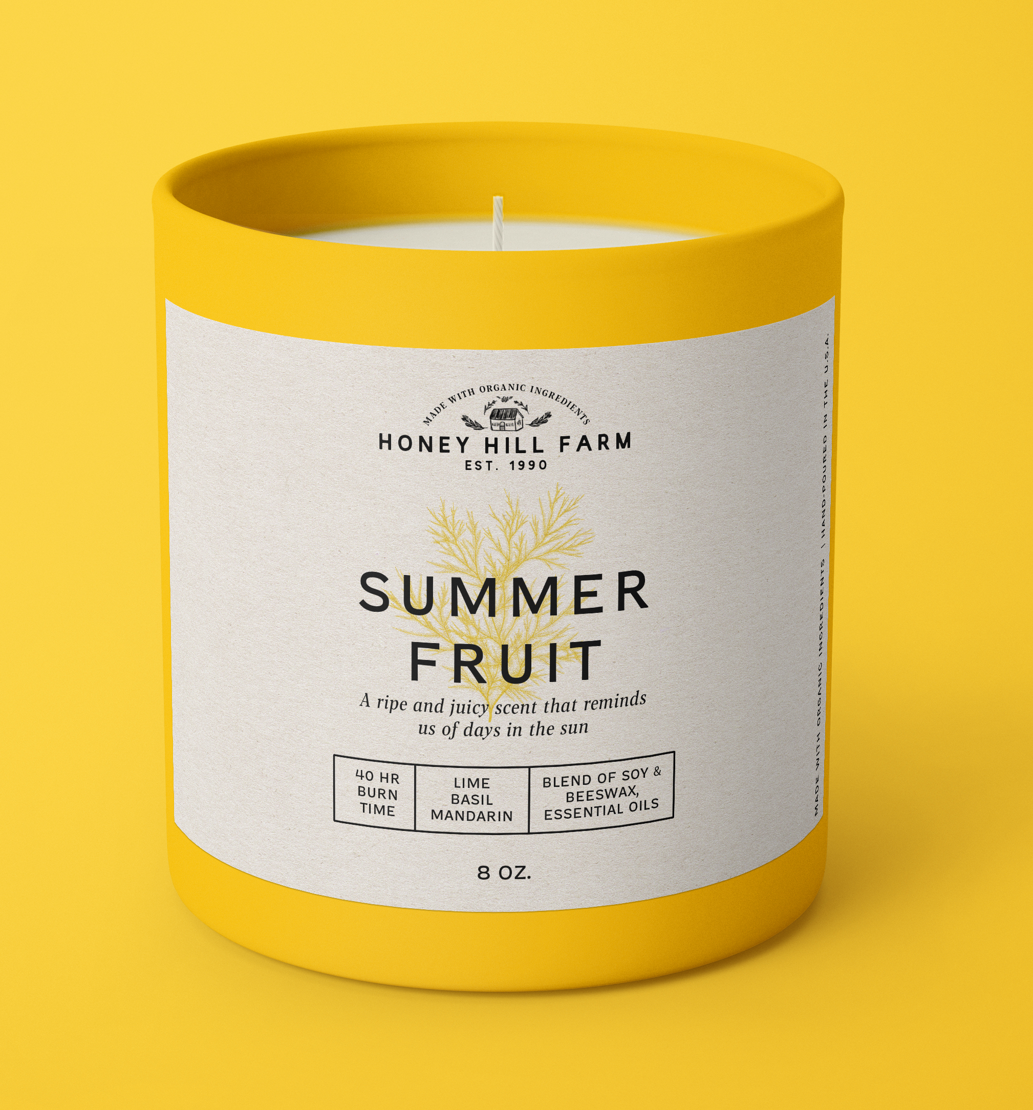
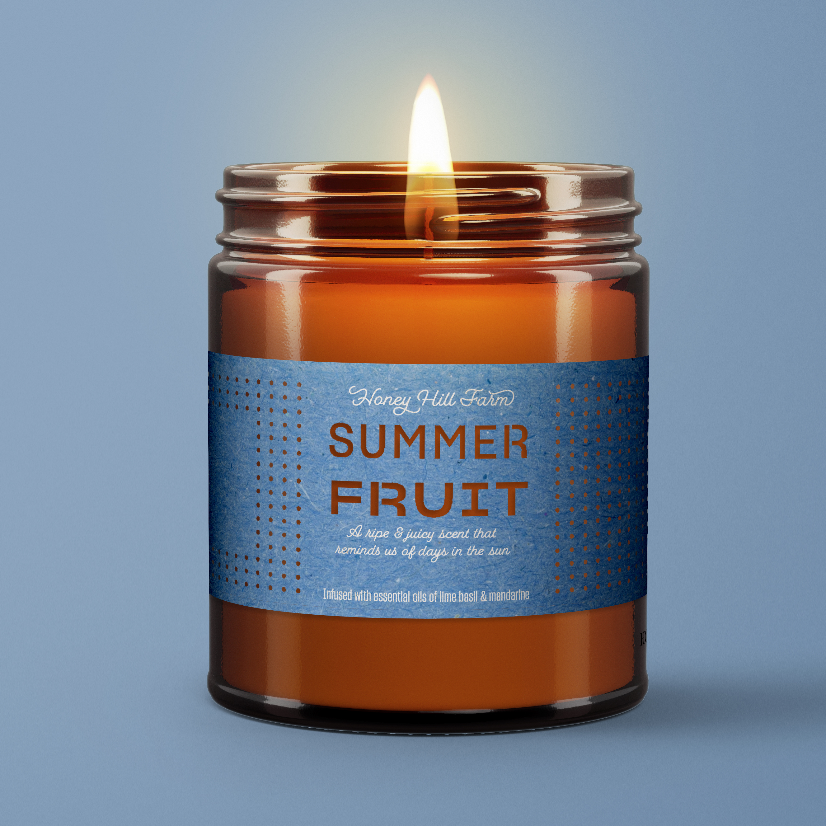
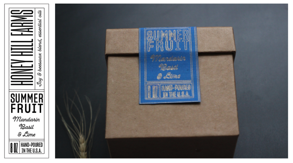
Most of the products required sticker labels for cost efficiency. The client requested labels that would match compliment the color of amber bottles but have distinguished pop-y colors like the prototype. I chose three different shades of brown to help differentiate similar products from one another, such as shampoos from conditioners.
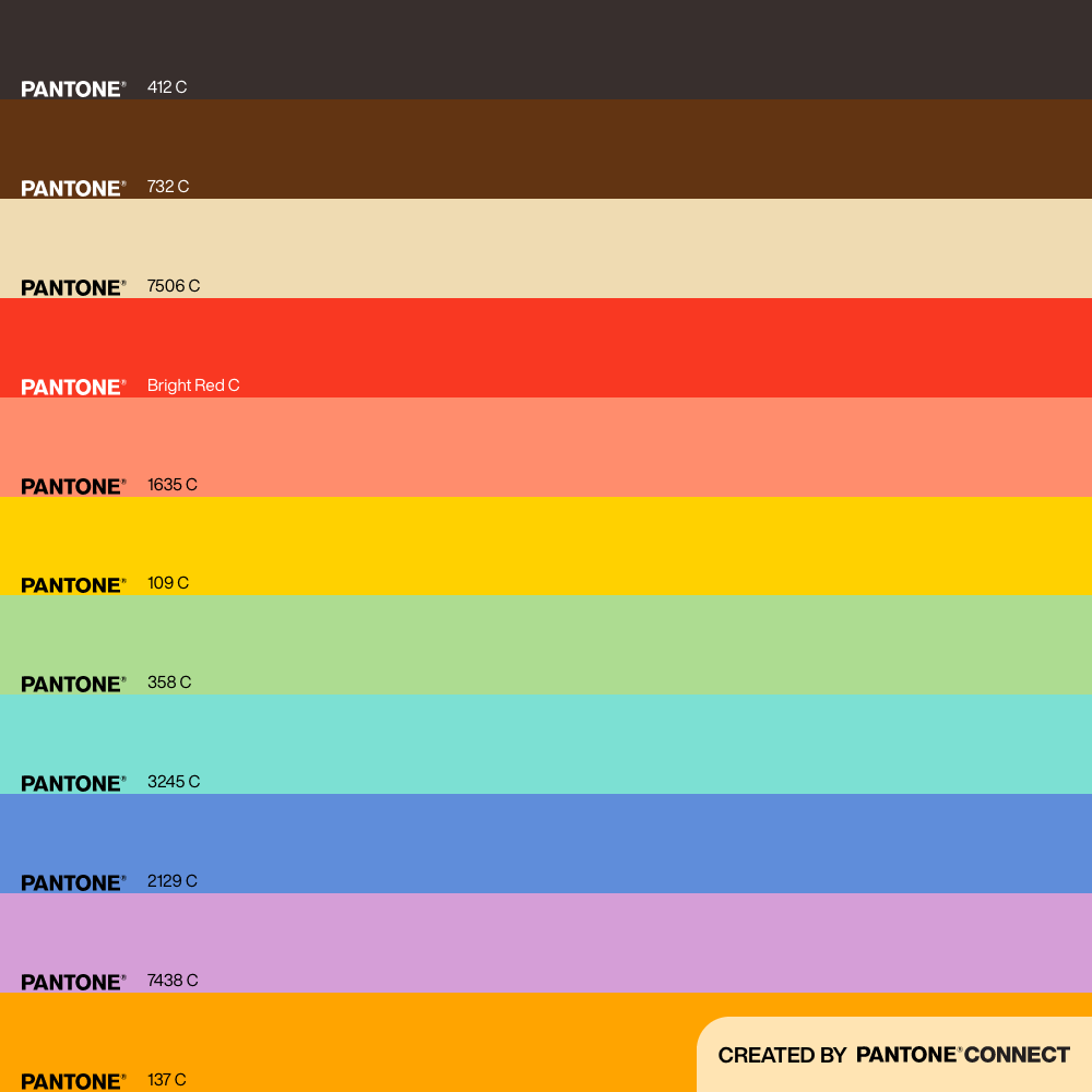
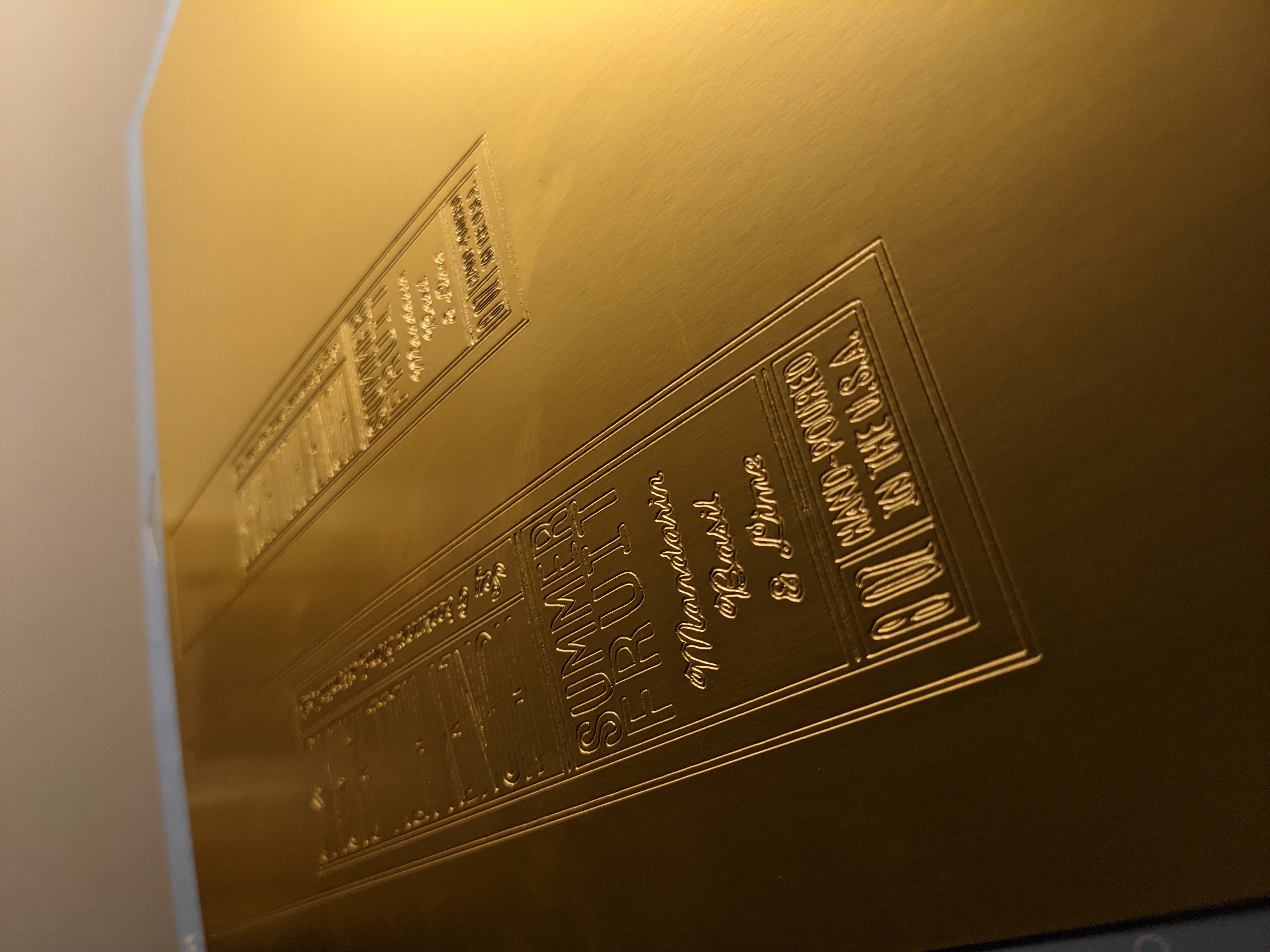
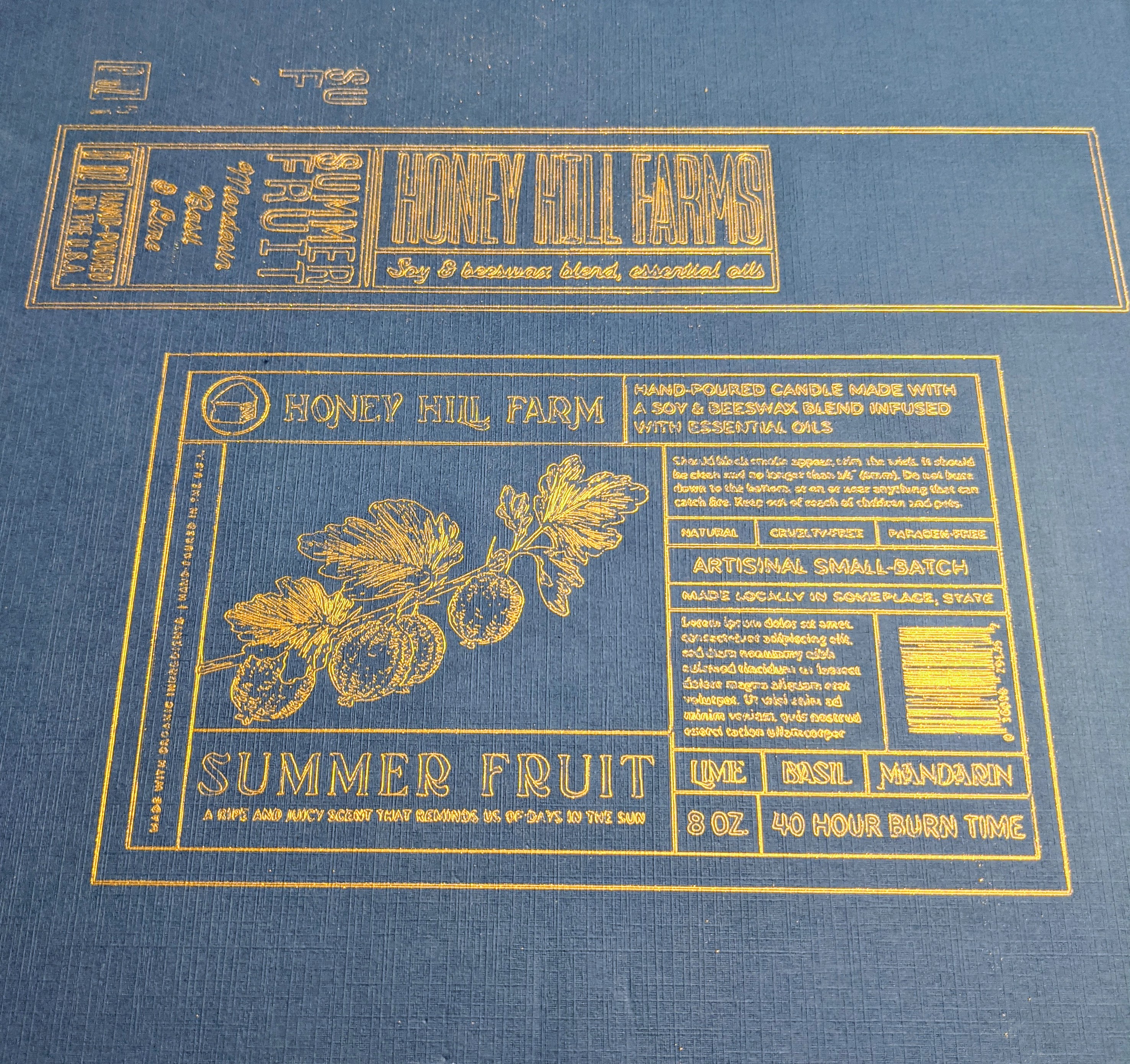
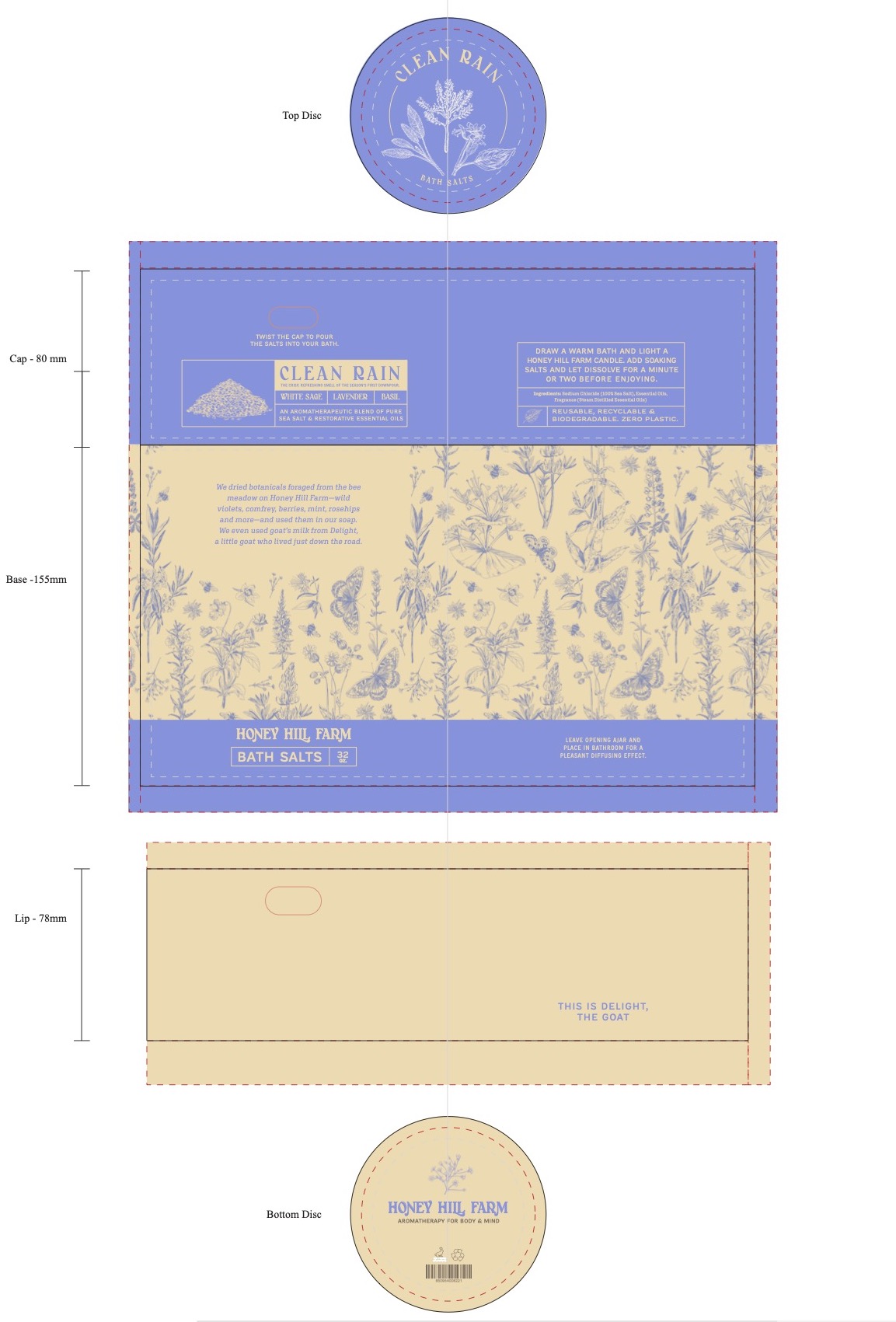
To achieve the bright colors the client wanted, the print vendor and I discussed a strategy in favor of custom inks over CMYK printing’s limited color gamut. this led us to flexographic printing, which requires pre-made plates akin to letterpress plates. With a limited budget, I developed a system where repeated verbiage across different scents could be confined to one plate. The elements of each product that were tied to a scent (name, image, scent notes, bar code, etc.) existed on their own plates.
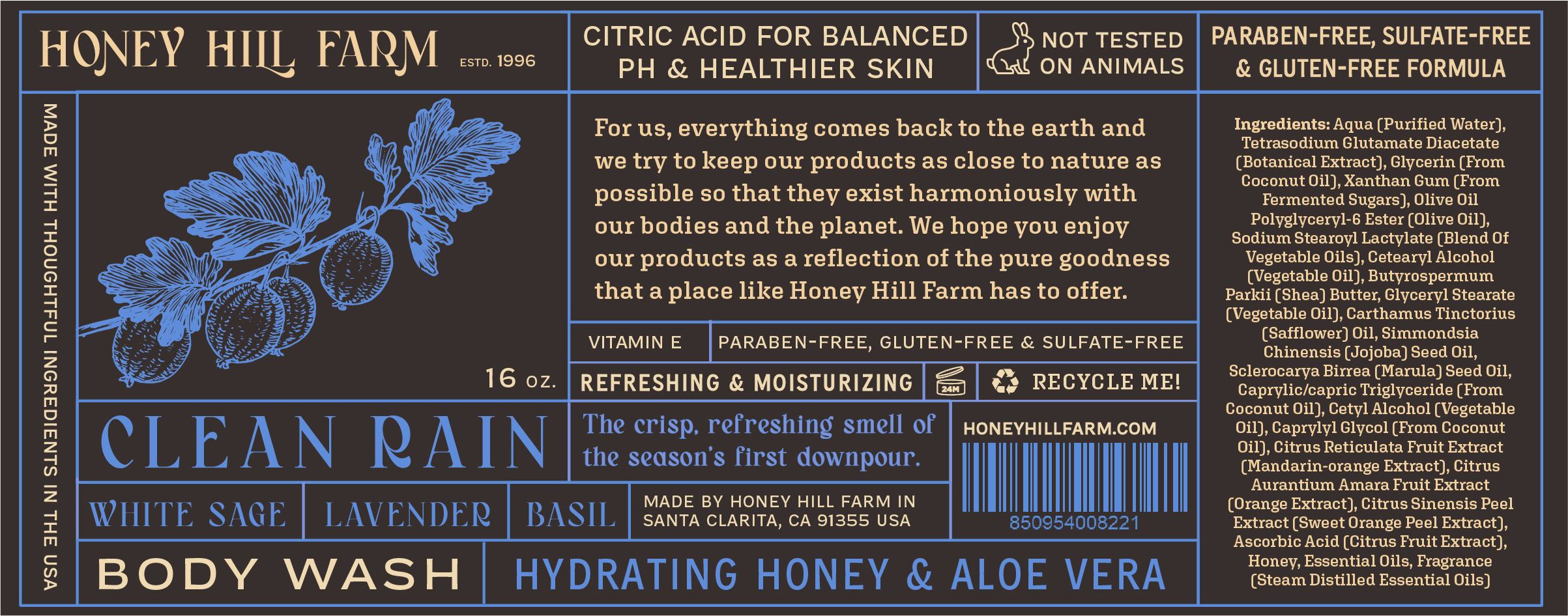

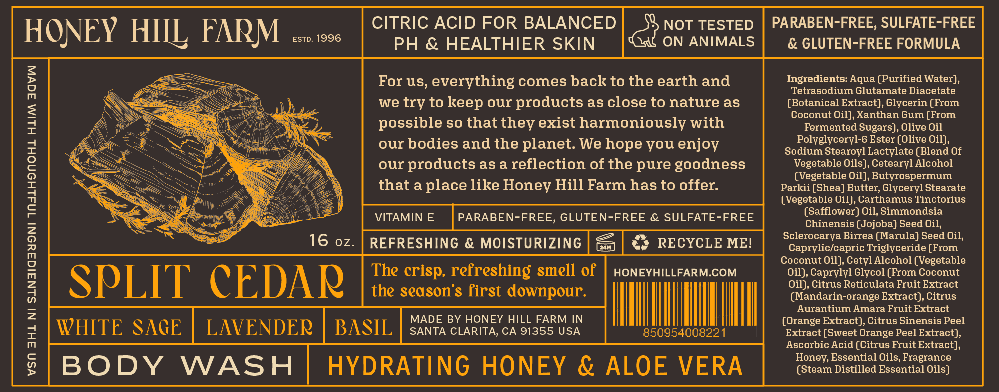
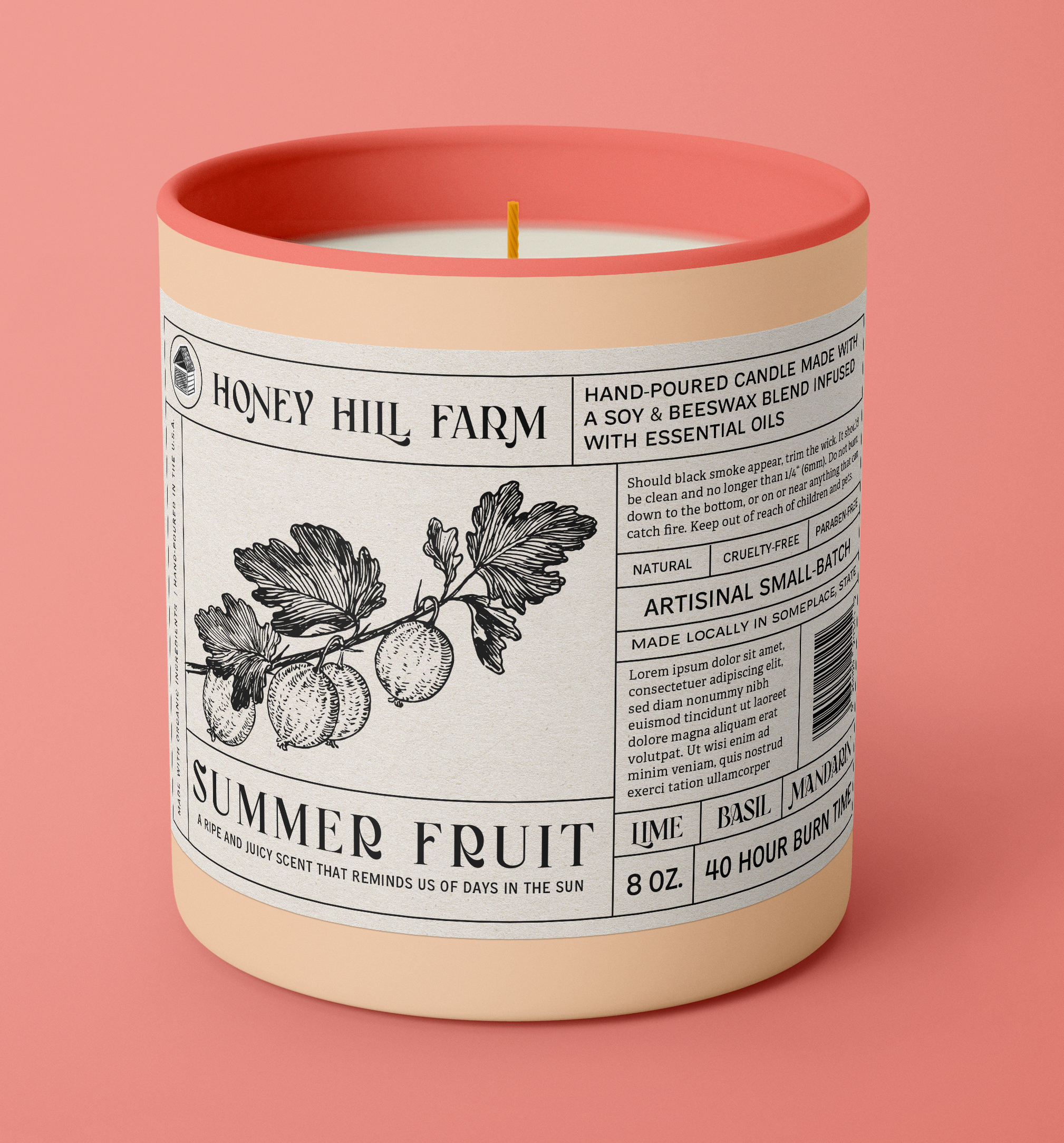
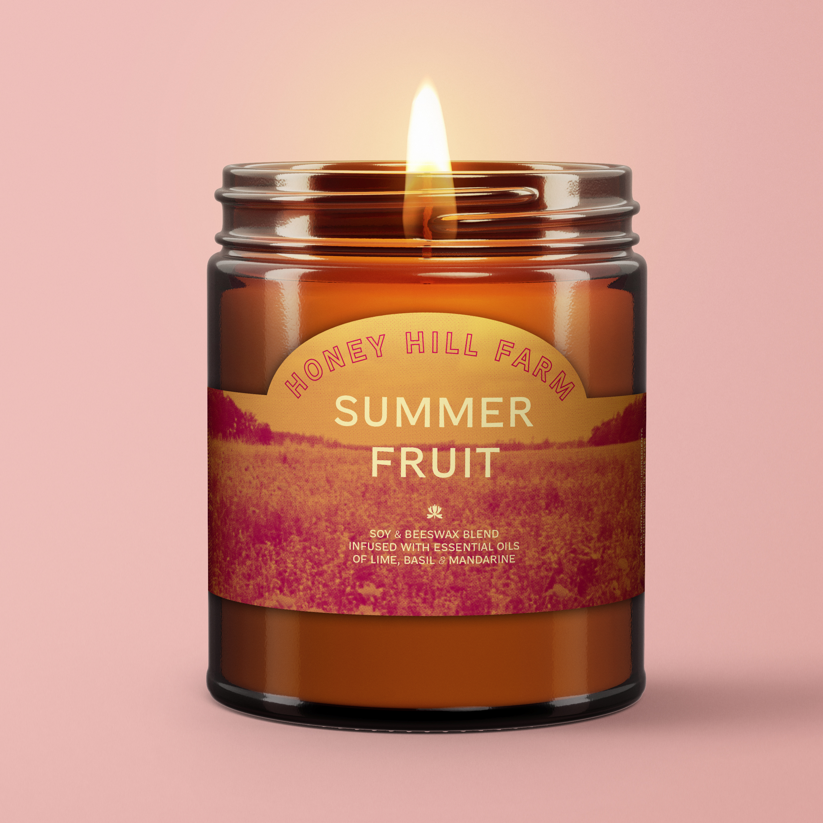
Test run of differing images and scents across the same product
The pre-set text meant that I needed variable typefaces that could squeeze or expand into these info boxes. OH NO Type Co.’s Compadre Variable gave me the freedom I needed to include all the product specs.
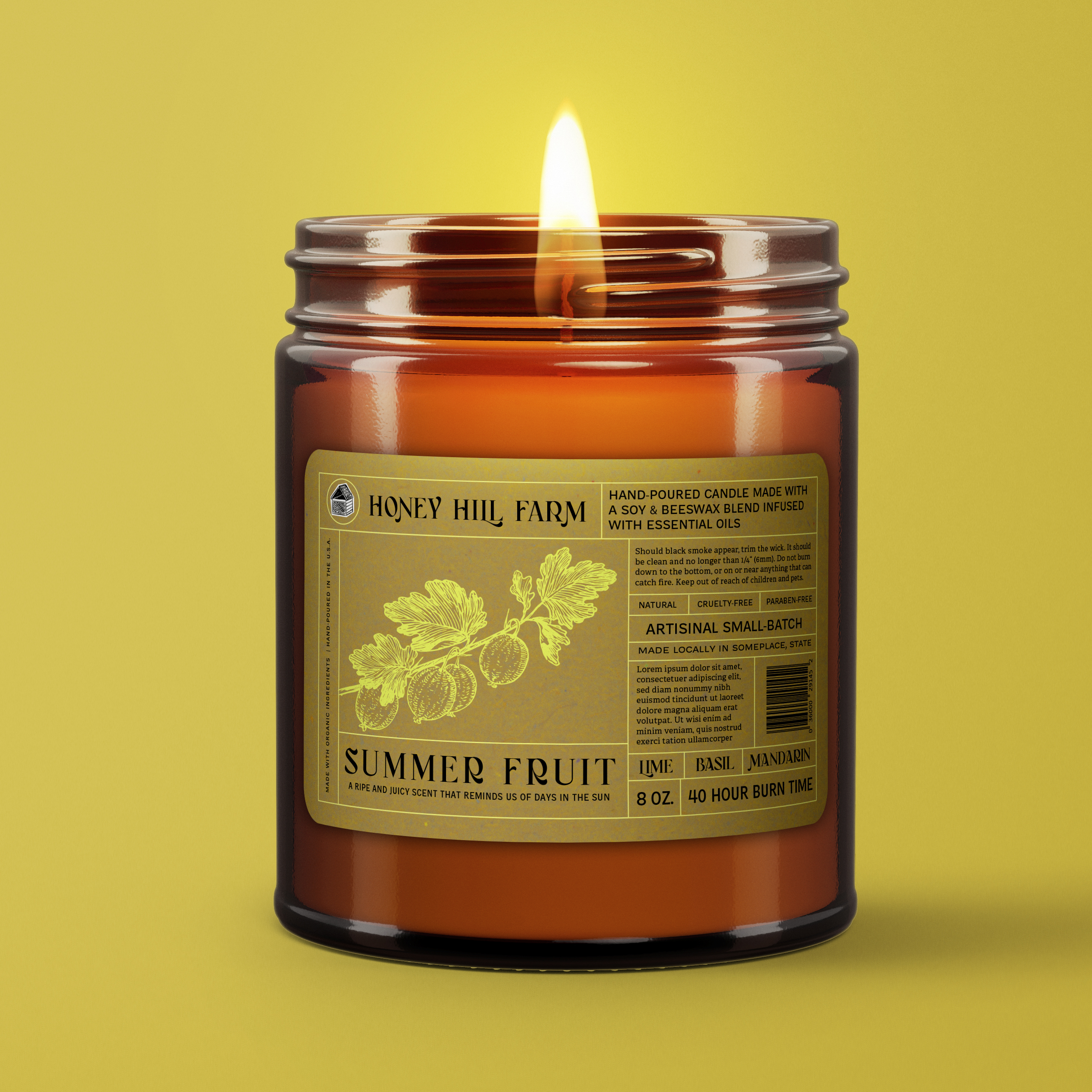
I used Clean Rain as the primary scent for developing different design strategies.
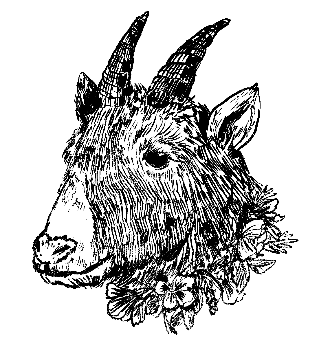
C. Illustrations
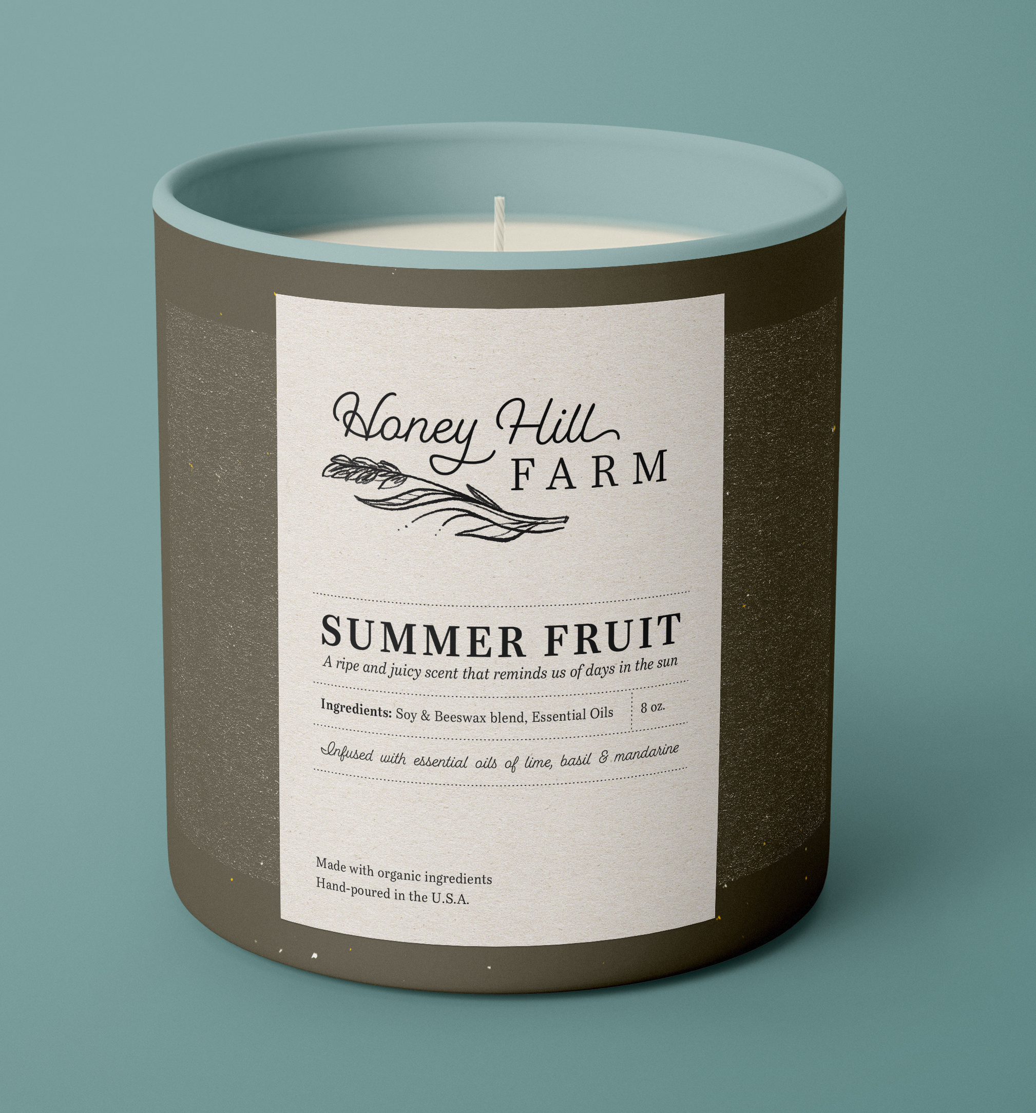
Imagery was one of the toughest challenges to accomodate on a budget. I came up with the idea of pulling royalty-free ink illustrations from Dover book libraries. I combed the nature specimen books for specific ingredients, animals, and wildflowers to bring Honey Hill Farm to life. However, there were clear style and resolution differences between images.

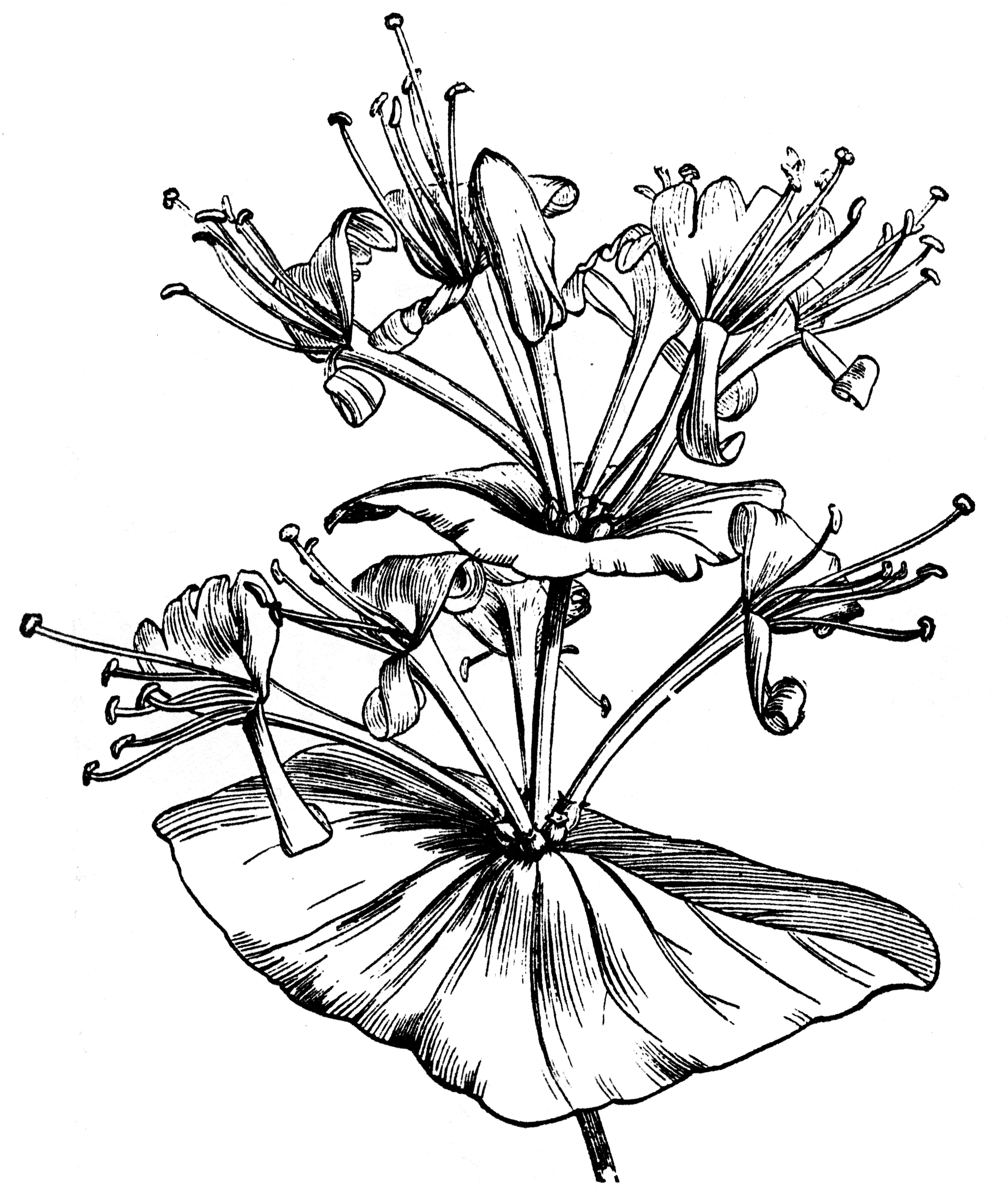
Two different flowers from the same book drawn in two different styles.
Solving this issue and unifying the style meant hours of tracing and adding or deleting details to create a consistent voice.

This seamless pattern was constructed from a variety of scans and traced at the needed 600 DPI as required by one of the vendors
Not everything could be found in the books which required custom illustrations of certain ingredients and products.
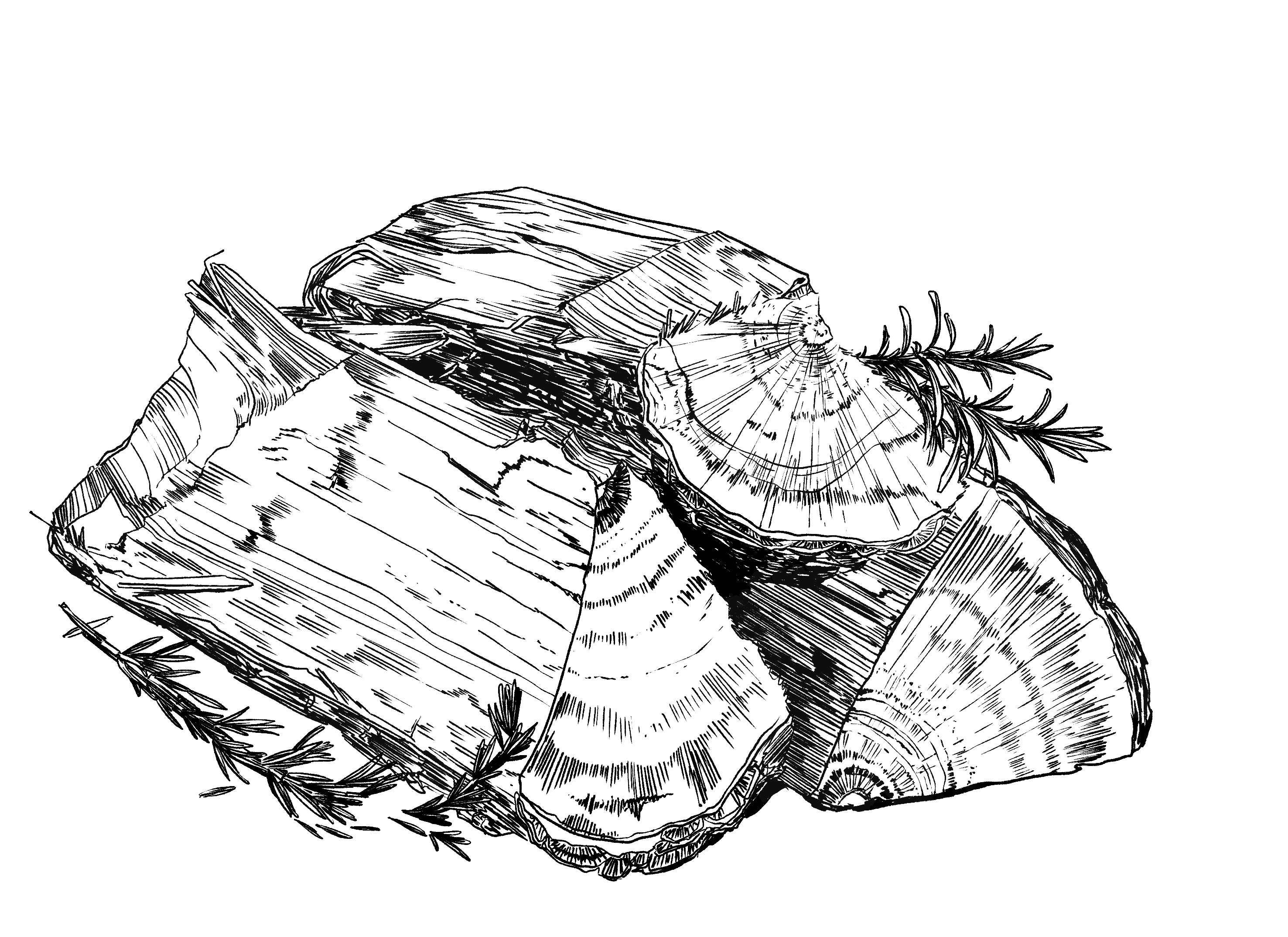

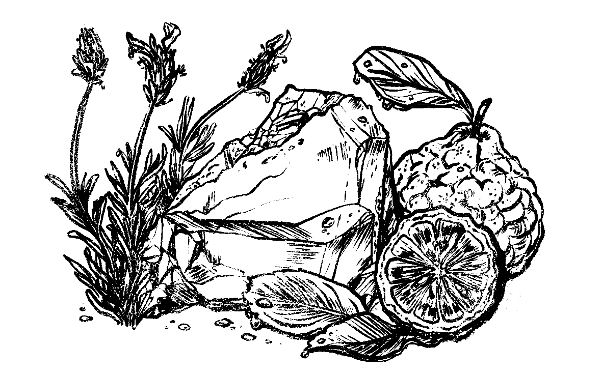
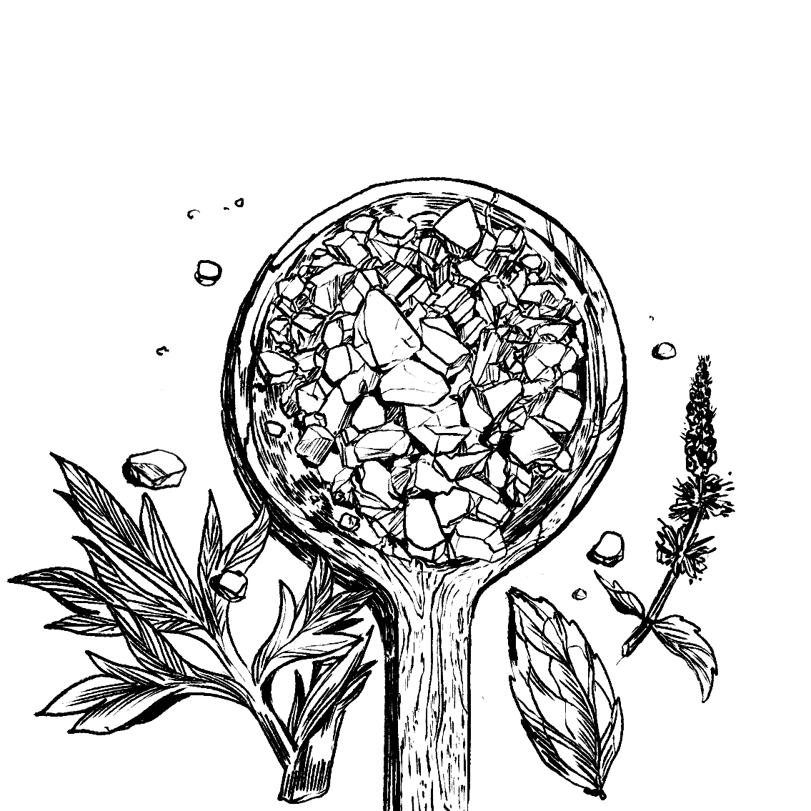
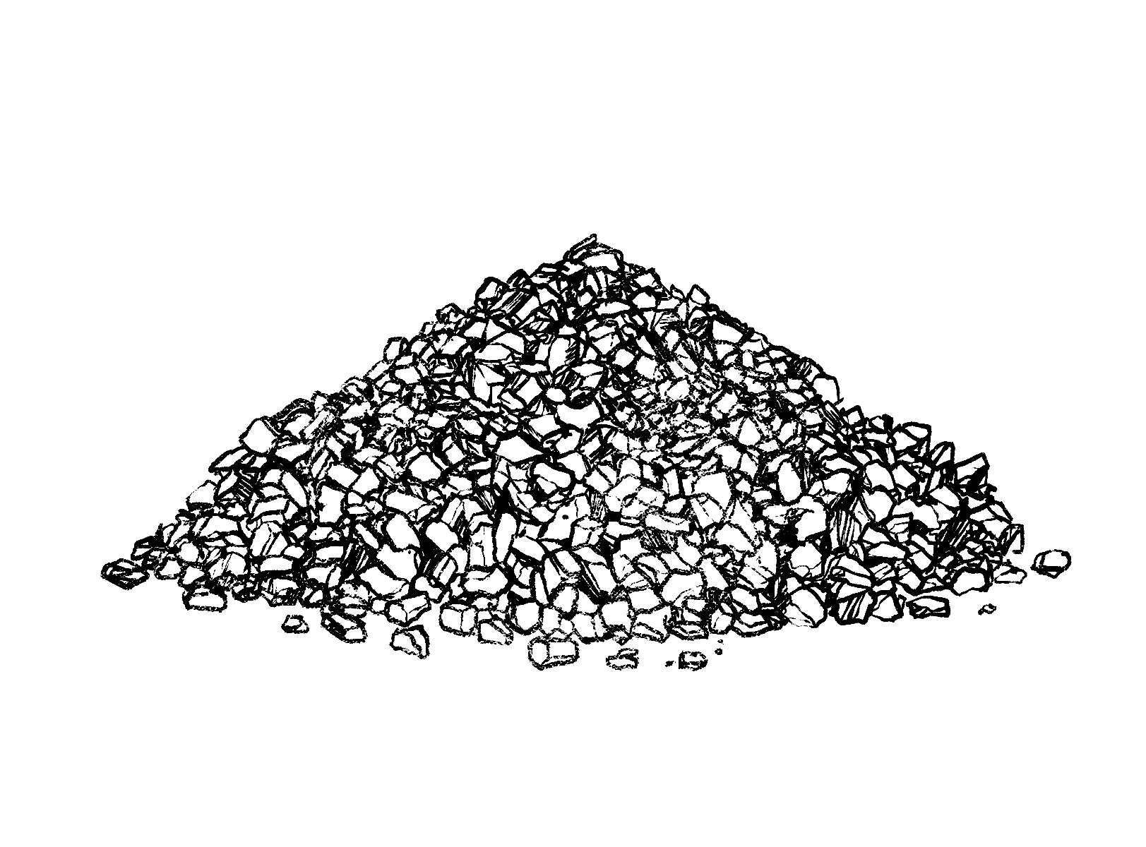
Drawings I created drawing from life and photos of different arrangements of ingredients and product mockups


D. Conclusion
In the end, I needed to step back from the project due to unagreed changes in the scope. I developed the system and strategies for the rest of the line before I handed off the files to another designer.